 A store’s layout shapes the way that customers find and engage with products, so determining the right fit is a crucial part of retail strategy. And while the options are seemingly endless, the free form layout has emerged as a popular option for smaller stores thanks to its capacity for experimentation. However, the free form layout is one of the most nuanced options of traditional retail strategy. Retailers will need to take into account human psychology and evolving mentalities to be successful with its application. Here’s how to do just that, and a few major retailers that are using it to great effect.
Jump to a section…
How to use a free form layout to grow sales
Take human behavior into account
Examples of a free form layout
Enhance your layout with technology
Ready to take your store layout strategy to the next level? Check out our comprehensive article, "Store Layout: The Ultimate Guide."
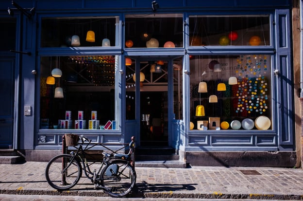
What is a free form layout?
A free form store layout arranges fixtures asymmetrically, which can give the layout a scattered look. The checkout counter will often be centered towards the back of the store, while displays are stationed sporadically around the floor. In boutique stores — where the layout is the most common — the cashier will frequently be stationed near the dressing room to assist customers.
The free form layout is about controlled chaos. It may seem like there’s no rhyme or reason for its structure, but nothing could be further from the truth. Instead, the free form layout relies on human psychology to help move goods. The free form layout allows customers to wander around the store as they like and promotes impulse purchases.
Retailers can subtly control the flow of traffic in a free form layout using signage. Strategically posting BOGO signs, clearance signs, or digital signage are effective ways to draw customers into a specific section. Digital signage is particularly effective at catching customers’ attention, as it tends to be vibrant and incorporates motion, which the human eye is drawn to.
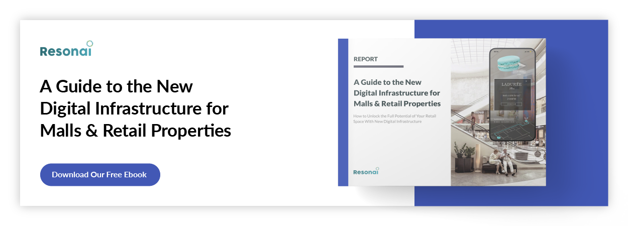
For more information about digital signage, read our ebook, “A Guide to the New Digital Infrastructure for Malls & Retail Properties.”
The free form layout is traditionally found in smaller stores, but a larger store might use it to create a visually interesting change or draw attention to a sampling of products within a single department. For instance, a retailer like Target may use it within its clothing department to encourage more browsing. Additionally, it can make the department feel like its own small store.
How to use a free form layout to grow sales
The free form layout is relatively complex compared to more common options like the grid store layout, and as such, failing to implement it correctly can have a negative impact on sales. That’s not to say that free form layouts are bad, but they’re not as simple as “put things wherever you like.” Use them carefully and you’ll find that your sales can increase dramatically. Consider these points when implementing a free form layout into your own business:
Maintain sightlines
The free form layout is built to pique interest in high-end products. As such, customers should have clear sightlines to your other offerings from nearly anywhere in your store. This is particularly important because the free form layout is mostly used in smaller stores, where it’s less likely that there will be overhead signs helping customers navigate. However, eye-level signage can be a powerful tool for conveying where items are located.
Be mindful of your space
The free form layout is powerful in small spaces because it's so versatile. However, this means retailers need to be more mindful of the walkways they create. Remember, your customers won’t be following any set path through your store as they might in other, more structured layouts. You need to account for this when placing product tables and signage. Have open walkways for bi-directional traffic and leave space for people to move around each other near demos. Managing open space is especially important post-COVID. Personal boundaries have expanded due to the virus, and failing to leave enough space for your customers may chase them away.
Take human behavior into account
Humans are a fickle bunch, and you’ll need to play to their psychology when you design your free form layout. For instance, people are more likely to buy something they touch. Additionally, people become less satisfied with their options as the number of choices increases. Luckily, the free form layout, when used correctly, is perfectly tailored to these psychological quirks. Allow customers ample room to touch and interact with the products you have on display, and curate your product selection to have variety without being overwhelming. In doing so, you’ll not only appeal directly to human psychology but also ensure that there’s ample space in your business for customers to move around and for you to place signage.
Examples of a free form layout
With those points in mind, let’s take a look at the retail chains that are using a free form layout to maximum effect.
American Eagle
American Eagle epitomizes the free form clothing boutique layout for major retailers. The company’s mall stores are a prime example of keeping open sightlines and using signage to direct customers around the store. American Eagle scatters waist-height displays throughout most of the space, with wall racks of pants placed around the store. It also places clearance items in racks towards the back of the store, which customers can see from practically any angle.
Louis Vuitton
Louis Vuitton offers an open and airy design, giving customers plenty of room to relax and wander in the environment. As a premium brand, Louis Vuitton’s strategy is centered around maintaining a specific, refined aesthetic. One particular quirk is that Louis Vuitton stores tend to have ample sitting space, which allows for a more relaxed environment.
Apple
Apple has mastered its aesthetic, and the layout of its stores is a crucial part of its identity. It projects the modern, intellectual image associated with its devices and creates a cozy atmosphere. While it typically arranges its products into neat rows, Apple adopts all of the other metrics found in a free flow retail layout. Apple puts a special emphasis on making sure that its products are available to interact with, which feeds back into the human psychology element of sales.
Enhance your layout with technology
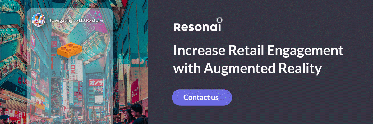
Regardless of the layout you choose to use in your store, technology can help inform your strategy. Resonai’s Vera platform is built to give business owners and building managers data-driven insights into their stores, offering tools like heat maps and digital signage to help grow customer engagement. Are you ready to learn more? Get in touch with Resonai today and set up a free demonstration.
Read More
5 Clothing Store Layout Must-Haves
With more consumers turning to ecommerce, it’s increasingly important to highlight the unique value...
How a Racetrack Store Layout Affects Retail Sales
From quaint local shops to international retail chains, one common dilemma resonates with every...
How a Grid Store Layout Affects Retail Sales
There’s a wide variety of potential store layouts, but the grid store layout has long been the most...