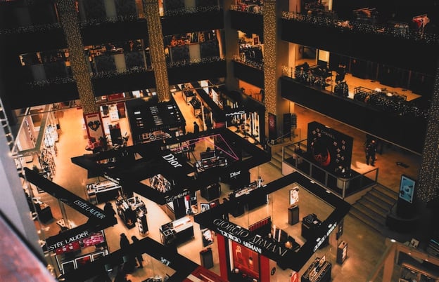
 Why do department stores look the way they do? The countless design decisions that go into every square inch of the modern department store were developed over decades and informed by in-depth market research to maximize their earning potential. These five key points have been thoroughly tested and proven to be the best practices for any department store layout plan.
Jump to a section…
Include a decompression space near the entrance
Use tilted fixtures to “pinball” customers through your shelves
Encourage impulse purchases at the register
Feature services and amenities, not just products
Implement convenient and attention-grabbing technology
Ready to take your store layout strategy to the next level? Check out our comprehensive article, "Store Layout: The Ultimate Guide."
Include a decompression space near the entrance
The first impulse for many property managers when designing a department store interior is to have a lot of big-ticket items at the front of their store directly in the path of entry for customers. While it is important to place some attention-grabbing items to draw people into your store, it’s equally important to provide some breathing room once they’ve entered.
This is sometimes referred to as a decompression space or a transition zone. It’s a calm and inviting portion of the interior that allows customers to transition from the exterior, and get into a mood that’s more receptive to making purchases. This is especially important for mall department stores, since the exterior can have a lot of noise and activity that would otherwise distract customers from engaging with your department store interior.
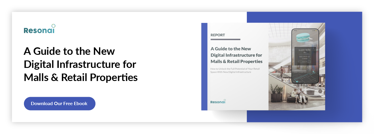
For more practical tips on how to easily augment your department store interior, check out our report on the growing role digital infrastructure plays in malls and retail properties.
Use tilted fixtures to “pinball” customers through your shelves
One common department store layout is a grid-based design that maximizes floor space and provides clear channels for customers to walk through. However, many designers have observed that tilting fixtures can redirect the flow of customers into locations that encourage them to spend more time browsing and engaging with similar products; this has also been referred to as a “pinball design.”
The ideal department store layout design should incorporate grid-like patterns and “pinball” fixtures to maximize convenience and visibility. Target does this exceptionally well, with its grid-like shelves along the perimeter and tilted fixtures in the center. Its design is so appealing and effective at convincing customers to buy more than what they initially intended that it’s achieved its own name: “The Target Effect.”
Encourage impulse purchases at the register
The most important part of the department store shopping experience is the point of sale — also known as the point of purchase. Generally speaking, the best decisions you can make in designing this crucial space are ones that encourage impulse buying.
Impulse buying brings in an enormous amount of revenue for retailers all over the world. It’s why grocery stores stock soda and candy directly in front of their registers; according to one study, this brings in over $6 billion in revenue from US shoppers. Some retailers go a step further with their department store architecture by extending check-out lines with corridors of shelves stocking low-price items like phone chargers or accessories.
Feature services and amenities, not just products
Even if it means you can’t stock as much inventory on the floor, including space for additional services that are relevant to your brand can be a big driver for sales. For example, cosmetics store Ulta Beauty has found consistent success for several years thanks to attached hair and nail salons. Customers waiting for their salon appointments find themselves browsing nearby fixtures, and customers looking for hair and nail products can schedule appointments to try new products firsthand.
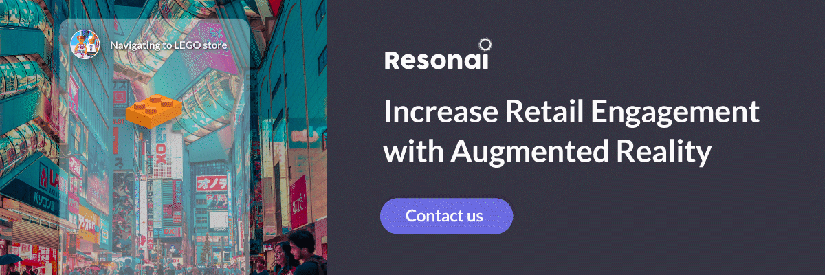
Implement convenient and attention-grabbing technology
Competition presents new chances to learn, and physical businesses like department stores can take many lessons away from the growth of ecommerce — including some that could never be replicated in an app or browser window alone. This includes using augmented reality tech in signage and capitalizing on the emerging trend of metaverse integration. For example, stores such as Dollar General and Whole Foods have begun to integrate QR codes to reduce checkout lines and integrate exclusive deals for shoppers.
There are many more ways to use the devices customers already have to drive better, more profitable shopping experiences, from AR-powered events to wayfinding to real-time analytics. If you’d like to find out how your business can grow by uniting physical and digital shopping experiences, reach out today for a free demonstration.
Read More
The Importance of Store Layout in Sales
Presentation is everything in a competitive retail environment. Whatever the size of your business,...
9 Small Retail Store Layout Tips, Tricks, and Examples for 2022
In 2008, Usain Bolt set the record for the 100m dash with a blistering time of 9.69 seconds. While...
How a Grid Store Layout Affects Retail Sales
There’s a wide variety of potential store layouts, but the grid store layout has long been the most...