Retail Store Layout: Designing For Maximum Revenue
By choosing the right retail store layout design, managers can increase revenue, enhance visual merchandising effectiveness, and much more.

Managing retail locations is about more than offering products to customers. Retailers must also ensure their store is accessible, clearly displays items, and uses visual merchandising techniques effectively. An engaging retail store layout means visitors are more likely to browse for additional products and become regular shoppers.
In this article, we’ll explore the core principles of retail store layouts with a focus on optimizing for maximum revenue.
Need to brush up on the fundamentals of visual merchandising? Check out Visual Merchandising: The Complete Guide For Modern Retail.
Jump to a section
Store exterior and decompression zone
Visualizing your store layout design
Retail store layout design
Store layouts are as varied as storefronts themselves. Some retailers will densely pack products onto a store floor, while others space them out for casual browsing. Many use signage to help customers navigate their surroundings, while a few let products speak for themselves. It’s even possible to combine traditional retail store layouts in unique ways — we’ll note some examples below.
Retailers can begin by considering their floor size, industry category, and the overall tone of their brand. From there, it’s a short step to implementing any of the following layout practices as appropriate:
Store exterior and decompression zone
All retail stores, regardless of size or industry category, have one thing in common: their entrances. The store exterior can attract customer attention through display windows or outdoor signage, encouraging bystanders to enter. Exteriors can also be an excellent opportunity to advertise special promotions, products, or line-ups that will appeal to your audience.
Upon entering the doorway, customers will find themselves in the decompression zone. This fifteen-foot space acclimatizes them to a new area and gives them a first impression of what to expect. Retailers can use the decompression zone to put customers at ease and help them navigate the store. For example, retailers like Best Buy ensure all departments are generally visible from the decompression zone so customers can see where to go. Others use signage to give directions or place popular items on a “power wall” that customers will notice immediately.
In all cases, it’s important to consider human psychology in your layout. After entering the decompression zone, approximately 90% of customers will turn right to begin exploring the store. For this reason, power walls are often placed immediately to the right, while checkouts are found to the left as the last thing customers see before leaving.
Grid
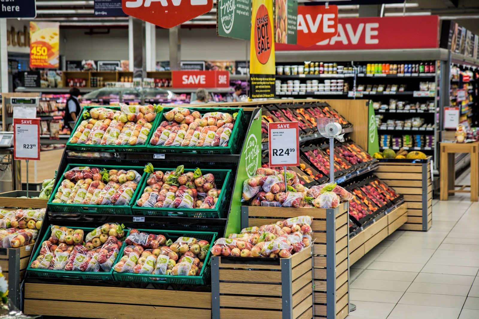
The most common retail store layout design is the grid, as seen in grocery stores, supermarkets, pharmacies, and many more. In a grid layout, retailers arrange products into densely-packed aisles that customers browse at their leisure. This arrangement maximizes product display, minimizes empty space, and is almost always the most familiar option for customers.
While it’s possible to organize categories in any way, the most effective layout places everyday and staple purchases at the back of the store. Promotion items and displays are at the front of the store, which customers will pass on the way to a commonly purchased item. This approach increases the likelihood that a customer will buy additional items on impulse or supplement current items.
Whatever the arrangement, grid layouts are ideal for storing high volumes of merchandise while maintaining a predictable traffic flow. Unfortunately, grids can make it difficult for customers to find items they want quickly. The layout is also a challenging format to experiment with — researchers have already studied it extensively, and its familiarity is one of its core benefits.
Herringbone
The herringbone store layout design resembles the grid when optimized for smaller floor spaces. It consists of an open central pathway leading from the checkout entrance while grid aisles branch off on both sides. This approach is well-suited for small hardware stores and even community libraries.
While herringbone grids make the best use of a small space, they also limit product visibility. Adding promotional displays to the end of each grid is one way to counteract this drawback.
Loop
The loop store layout takes customers along a single path, past all available products, before arriving at the checkout. This approach maximizes overall product exposure and streamlines customer traffic, but it can also limit browsing opportunities when traffic volume is high.
One of the most famous examples of loop layouts in retail is IKEA, which guides customers from department to department. Loops are also standard in museums, gift shops, and specialty shops.
Free-flow
Unlike the previous designs, free-flow layouts follow no predictable traffic pattern outside of those dictated by human behavior. This distinction sets free-flow apart from a genuinely unplanned design — it still follows specific rules, even if to the human eye it doesn’t seem to.
Retailers can place products and displays in any suitable arrangement but typically leave enough open space for customers to move about comfortably. Instead of structured aisles, products fit into clusters that align with shopping principles. For example, high-value products still go to the right of the entrance while staples go to the back. Unlike grids, however, free-flow departments are not kept apart by aisles or other barriers.
Free-flow layouts are highly-experimental by design and an excellent choice for retailers looking to highlight different promotional displays. Unfortunately, it does tend to limit available space for products compared to traditional grids. You can see free-flow layouts in small boutique stores or within open areas of larger stores, such as a bookstore display area.
Back to topVisualizing your store layout design
Finding the right layout for your space often requires some degree of experimentation. Unfortunately, doing so is not always practical. If you want to test out a herringbone-loop design, for example, you’ll need sample models to visualize the space. For this reason, retailers increasingly turn to digital tools and retail store layout software that can create and optimize layouts on the fly.
Resonai’s comprehensive computer vision smart building platform, Vera, is one such solution. With Vera, retailers can create a highly-accurate, 3D version of every store, shelf, and individual product. From there, it’s easy to run scenarios and push remote recommendations to each location. A supplementary Vera-powered app helps retailers review data and real-time feedback before adjusting visual merchandising strategies.
Are you ready to experiment with your retail store layout? Get in touch with Resonai today and set up a free demonstration.
Subscribe to Our Newsletter!
Read More
Customer Analytics In Retail: How Data Drives Dollars For Vendors
Business is an information game: the more you know, the better your decisions, and the higher your...
5 High-Value Use Cases For Retail Analytics
Brick-and-mortar retailers have been through a gauntlet of change. The rise of ecommerce put many...
The 8 Best Retail Analytics Companies For Modern Vendors
Digital stores thrive on analytics: tracking where visitors come from, how long they spend on each...

